Component design (Badges) - Telstra
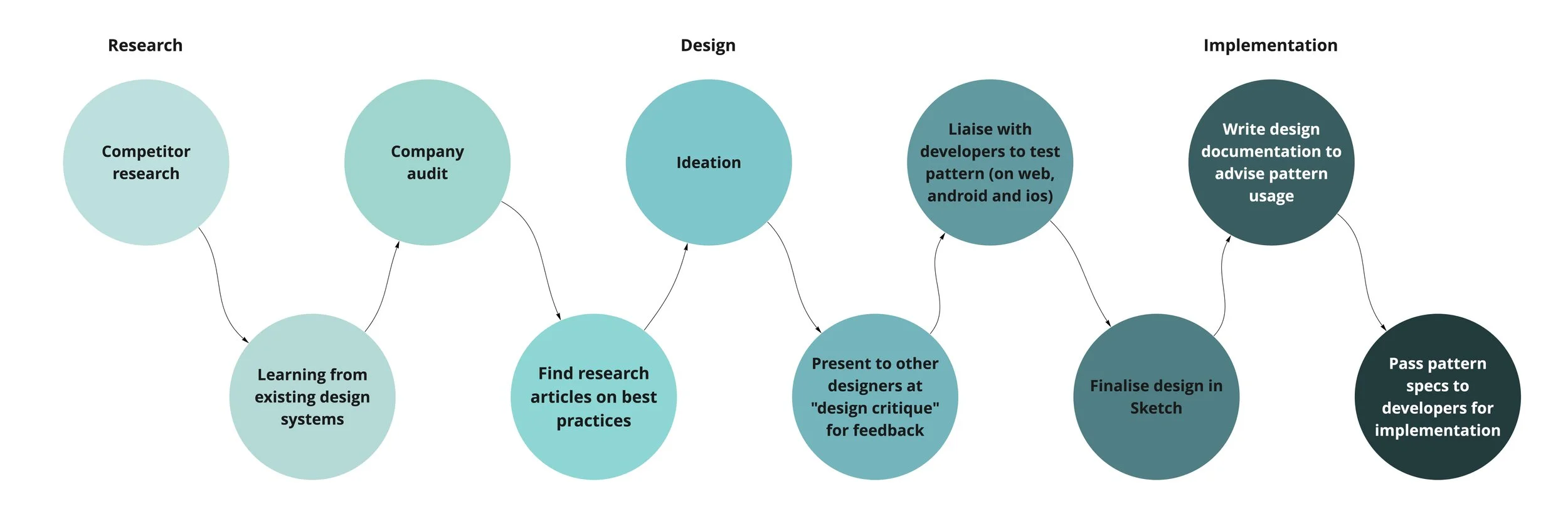
While at Telstra, I had the opportunity to work with the design team that was charge of implementing new components in our design system. During this rotation, I took ownership of designing a pattern (badges) from research (UX and Visual Design) to implementation.
Approach
Research
Following the guidance from the visual designer on the team, I first did research on badges from the UX and Visual design perspective. To do this, I looked at how existing apps utilised badges, how current design systems from other companies are documenting their badge designs , and also looked at best practices, both in the existing design systems and in research articles. Below is a screenshot of badge designs from existing apps and the utilisation of rose, thorn, bud method to determine the positives, negatives and the opportunities.
Finally, I did an audit of our current usage of badges within the company to determine how and where we are currently using badges.
Design - Ideation
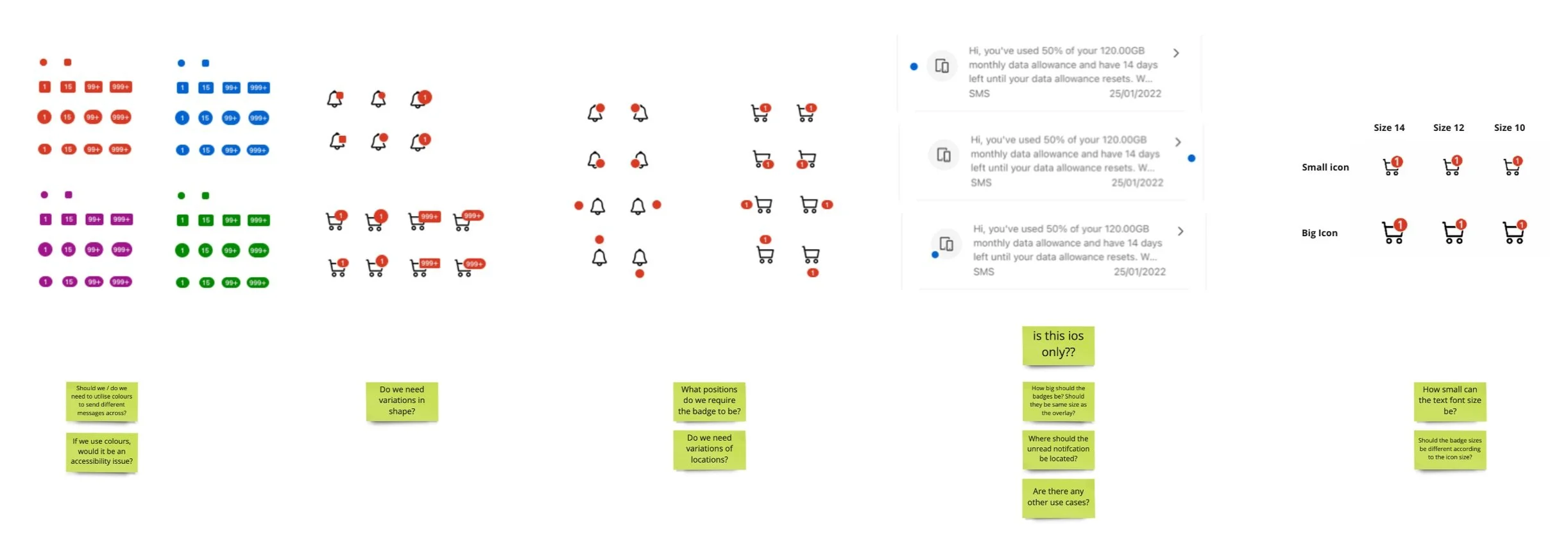
With ideation, I started off with mind dumping all possible shapes and positions and started playing with our design system colours while matching it with our current icons. Afterwards, I wrote out some thoughts and questions to challenge what was required, and why.
I then started to funnel in, deciding on a shape and determining our variants based on our current use cases in the company. I also played around with our colours, to ensure that it meets accessibility guidlines.
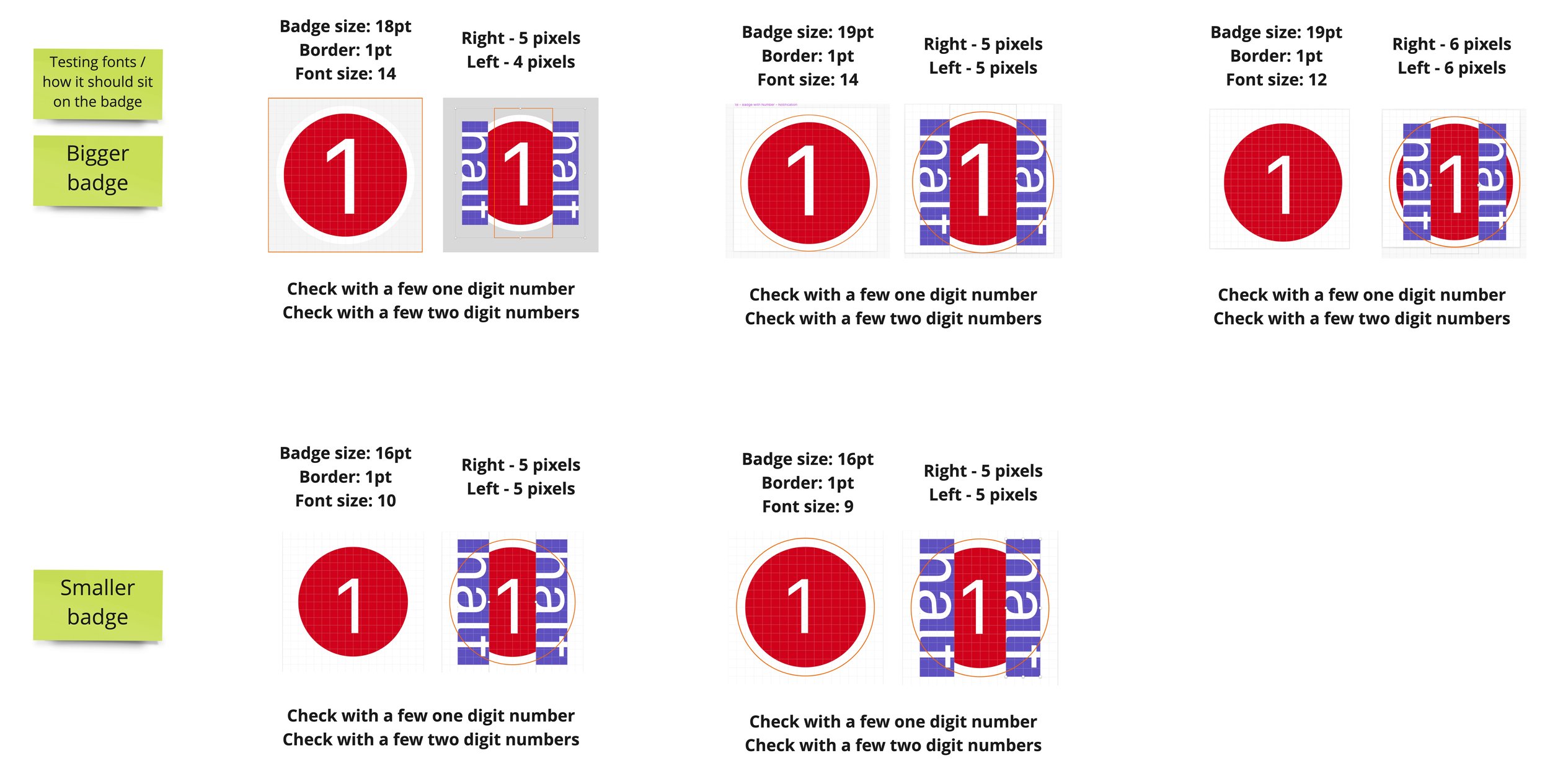
Next, I began further exploring sizing of the badge and how it will look not just with the icon, but also with the page as a whole in the app. I also took the prototype to a design critique, where other designers were able to give their feedback.
One issue which we did not foresee, was the positioning of our badge and how that could potentially obscure some of our existing icons. Initially, we considered having four positions (like many other design systems) to prevent obscuring some of our icons, however for consistency sake, we decided to lock our icon into one position - top right corner.
Finally, I started to liaise with the developers on my team to determine which spacing and specs would be the best for web, IOS and android. I created some prototypes for the developers to follow.
Implementation
After finalising designs on Sketch and handing over specs to developers to implement, I also wrote a design documentation as an internal resource, to advise on the usage of badges within telstra. The badge components are also implemented into sketch, for designers to utilise.


